Zion U, just one letter off popular singer Zion T., is a brand that knows how to keep it simple, showing the restraint to not go overboard. 

To go with the new classic puffer jacket, Zion U added a pop of color and new silhouette to create the next “must-have” jacket this fall. 

For details, focus was on the neck with collars and ascots, matching well with the collection’s clean lines.

And the brand kept the colors muted with a pop of red, helping it blend in with the Seoul city lifestyle.

Creating a mix of popular trends, Zion U’s wearable collection will definitely be a favorite of Seoulites this fall.

자이언티와 한글자 다른 브랜드 자이언유는 어떻게 간단 명료할 수 있는 것을 잘 알고 있으며 확실히 극단적이지 않은 브랜드다. 

자이언유는 새로운 클래식한 패딩과 어울리기 위하여 대담한 색채, 색다른 실루엣을 더해 올해 가을에 필수템을 만들었다. 

디테일을 보면 칼라와 넥스카프처럼 목 쪽으로 악세서리에 초점을 두었는데 컬렉션의 분위기가 잘 맞았으며

빨간색을 제외한 옷의 색깔은 질박한 색깔이기에 서울시민 라이프스타일과도 잘 어울린다.

인기가 많은 트렌드를 섞어 디자인하는 자이언유는 서울에 사는 사람들에게 가장 좋은 컬렉션이 될 것이다.

Photos by: Lian Olga

Blindness drew inspiration from the Baroque period, making a dramatic, eclectic collection for the upcoming season.

The mix of full sleeves with bold jewelry and pearls  blurred modern gender lines, along with bandeau tops, and created a new standard for unisex wear.

One-sleeve jackets and belts added the perfect amount of attention to the waist, while eyelet details, quilted pants, and sheer shoulder-high gloves gave off an air of extravagance.

Baroque even knew when to tone down the pieces by throwing in a bit of casual wear now and then, though the knee high boots fell a bit short.

Glamming up the toil of the every day, Blindness’ balance of art, drama, and detail is a perfect cocktail for the bold and stylish.

브랜드 Blindness는 바로크 시대에서 영감을 받아 드라마틱하고 절충적인 컬렉션을 만들었다.

불룩한 소매와 대담한 쥬얼리, 반도 탑으로 남성과 여성간에 미묘한 차이를 흐리면서 유니섹스 옷의 수준을 높이게 만들었다. 

원 슬리브 자켓과 벨트가 허리로 관심을 끌어주며 진정한 드라마식으로 아일릿, 어깨까지 올라오는 쉬어 장갑 디테일을 추가했지만 마지막으로 집중해야 하는 것은 퀼티드 팬츠다.

드라마틱한 컬렉션이어도 캐주얼한 옷 몇벌로 밸런스를 진정시킬수 있는 방법을 잘 알고 있는 것 같은데 옷보다 무릎까지 오는 부츠만은 예상을 벗어났다.

Blindness는 아트, 드라마, 디테일의 균형을 찾으며 똑같은 스타일이 있는 사람들의 힘든 하루를 밝혀 줄 것이다.

Photos by: Lian Olga

Photos by Lavar Plummer

Gliding along the runway, Hakan Akkaya’s F/W ‘17 collection both intimidated and dazzled the audience.

Here, there is no such thing as simplicity; each outfit has something to observe.

With sheer, cut-outs, and leather, the 7-year-old brand mixes up textures as well as focus—You never know if it will be fringe or belts that catch your eye as they nudge the collection from moody to chic. Bits of gray and sparkle were a shining beacon against the dark palette.

Zippers marked various states of dress, and sometimes multiple layers, alongside a few bondage-inspired undergarments, reminiscent of last year.

Hakan Akkaya’s mysteriously addicting collection has once again showed us his strength: pieces of power.

하칸 아카야의 F/W ‘17 컬렉션은 런웨이를 가볍게 미끄러지며 청중을 긴장하게 함과 동시에 청중들의 눈을 멀게 했다.

이 런웨이에서는 각 의상들이 볼 것을 제공하기 때문에 심플함은 존재하지 않는다.

7년전에 설립된 브랜드는 얇은 천, 컷아웃,그리고 가죽과 함께 감촉과 포커스를 적절히 섞어낸다. 의상의 분위기가 음울한 분위기에서 시크한 분위로 바뀌며 청중들은 장식이 술인지 벨트인지 눈치채지 못할 것이다. 어두운 옷 중에 회색과 반짝이는 직물이 있어 옷을 더 빛나게 한다.

지퍼는 드레스의 다양한 면을 표현하며 때로는 층을 표현하기도 한다. 또한 작년의 디자인에 영감을 받은 속옷이 표현되기도 했다.

하칸 아카야의 신비롭게 중독성 있는 컬렉션은 하칸 아카야의 장점을 다시한번 강조했다. 강하고, 눈에 띄는 그의 컬렉션을. 

Cres. E Dim: A brand for the hipsters, the effortlessly cool, the popular. Ranging from musty, earthy hues to rich jewel tones, the brand had its signature loose-fitted look on point this season. Oversized hoodies, jackets, and wide-legged pants were belted at the waist for some shape, with a dash of asymmetry in the details. Though the collection featured calf-length hems and intriguing layers, the similarities to its previous collections—for example the exaggerated sleeves that once again appeared on the runway—has us wondering if the “Cool Kids Survival Guide” theme’s lifespan is dwindling.

크레즈에딤은 노력하지 않아도 멋있고 인기가 많으며 힙스터 같은 사람을 위한 브랜드다.

이번 시즌에는 황토색깔부터 보석 닮은 색깔까지 브랜드의 헐렁헐렁한 포인트를 보여줬다. 오버사이즈 후디와 자켓, 그리고 와이드 팬츠가 허리에 벨트를 매게 되어 있어 모델들의 모양을 자랑하며 세부적으로 보면 비대칭도 볼 수 있었다.

컬렉션은 카프 렝스 하의와 흥미로운 레어링이 있어도 전 컬렉션과 유사한 점이 있다고 생각되는데 런웨이에 롱슬리브 셔츠가 또 나왔기에 ‘어떻게 멋있는 사람이 될 수 있는 방법’이라는 주제가 곧 사라질까 생각하게 된다.

Photos by: Lian Olga

Upgrading the basics of menswear, Tiiki presented twists to old classics. 

The runway was full of eye-catching contrasting elements, like stripe and plaid chapped pants, textured sleeves, and bright collars.

Unexpected combinations have your eyes doing a double-take and examining every inch of this collection.

Clearly inspired by urban influences, the looks were dominated by hoodies, sweatshirts, and bombers.

Tiiki even brought back joggers, textured and in rich shades of green and blue; on top lied jackets with clean lines interrupted by bulky sleeves. 

Our favorite? The grommet bomber. Let us know your picks on Instagram @dispurs.mag.

남자 패션 디자이너 티키는 클래식한 스타일을 새로운 방법으로 변신한 모습을 보여주었다.

런웨이에서 스트라이프와 플래드 chap 바지, 스테이트먼트 소매, 밝은색 컬러는  대조적인 색으로 가득했으며 예상 못 된 옷이 많으니 컬렉션을 보면서 계속 흠칫 놀라는데 컬렉션을 면밀히 살펴보게 된다.

후디, 맨투맨, 봄버 자켓이 컬력션의 대부분을 차지해 어반 스타일에서 영감이 받는 것이 분명하다.

티키는 텍스쳐가 있고 선명한 녹색, 파란색으로 조거 바지도 부활시키며 부피가 큰 소매를 제외 시키면서 깨끗한 자켓과 짝이 되다.

저희 가장 좋아하는 옷은 쇠고리 봄버 자켓인데 여러분들이 인스타그램에 @dispurs.mag 태그하고 티키 컬렉션 중에 가장 좋아하시는 옷이 무엇인지 알려주세요!

Photos by: Lian Olga

MUNN’s gentlemanly style is back for another round with their F/W ’17 line. 

The key to this season’s collection lied in matching jacket and trouser sets. Both the dominance and combination of stripes and plaid gave these looks an old-school grunge vibe, tying the concept together with a guitar case and guitar print sweaters.

Coming in unexpected textures, thick scarves bundled up the models, as belted waists offset the loose-fitting pieces.

Playful, “alternative” masculine details were a pleasant sight, the ruffles and colored piping standing out against the monochrome.

MUNN’s ability to master the balance between stylish and wearable, as well as vintage and modern, took it to the top of our must-haves this fall.

문의 “젠틀맨” 스타일이 FW 17시즌에 돌아왔다.

이번 시즌의 컬렉션 포인트는? 맞추는 자켓과 바지 세트이다.

컬렉션에 많이 나온 스트라이프와 플래드 패턴이 기타 맨투맨과 케이스로 옛날의 그런지 컨셉을 만들었다.

예상 되지 않은 텍스쳐로 만든 목도리가 모델들을 따뜻이 둘러싸면서 루즈핏 옷과 벨트도 보여주었다.

모노크롬과 대조된 러플스와 화려한 피핑 같은 특이한 디테일이 있었다.

스타일과 착용감의 균형과 빈티지와 모던의 균형을 잘 만들기에 문이 ‘가을의 필수템’ 맨 위로 올라갔다. 

Photos by: Lian Olga

Photos by Lavar Plummer

Chinese-Japanese Canadian designer Dan Liu is known for his elegance. This season’s collection was an assortment of flirty hems that brought out a feminine, romantic vibe when paired with the pops of pink on the eyes and cheekbones.

The charming palette of pinks, blues, reds, and neutrals went well against the scarves that will help us keep the essence of summer a bit longer. Kissing the heads of select models,the ornate touch of masquerade masks was a welcome accessory as Liu cohesively brought together sweet patterns and delicate details, like contrast lining.

A collection with the ability to take you from day to night, these feminine looks—with just a hint of a preppy vibe—are the definition of casual elegance.

중국-일본계 캐나다 디자이너 단 리우는 엘레강스함으로 잘 알려져 있다. 이번 시즌의 컬렉션은 여러가지 매혹적인 느낌이 있는 원피스로 광대뼈와 눈을 분홍색으로 화장 했을때 함께 입으면 여성스럽고 로맨틱한 분위기를 끌어낸다.

분홍색, 파란색, 빨간색, 무채색들의 매력적인 색상들은 여름을 생각나게 하는 스카프와 잘 어울린다. 마치 대조되는 색상과 같이 리우는 은은한 디테일과 달콤한 패턴을 조합하여 가면 무도회의 가면을 악세서리로 쓰는 것은 즐거웠다.

리우의 컬렉션은 밤낮으로 입을 수 있으며 약한 프레피한 느낌을 주는 여성스러운 룩은 캐쥬얼 엘레강스의 상징이다.


Dipped in sultry neutrals, L.aimant is three things: Clean, classic, and feminine.

Wide legs and long silhouettes offer sophistication and comfort amongst whimsical pieces.

Adding a bit of stripes for pattern, the collection turns its focus to texture to create a refined minimalist look—a nod to its Parisian influence, perhaps?

Though An kept things sweet with feminine a-line skirts and simplicity, the bat-like top with matching cuffs were an unexpected delight.

L.aimant designer Jaehyun An’s ability to balance simplicity with great visuals is what makes him stand out amongst the Generation Next designers. What direction will he head towards next?

올해 관능적인 무채색으로 만든 레망뜨는 깨끗하고 클레식하고 여성스러운 컬렉션이다.

그림 같은 옷 중에서 와이드 레그 바지와 롱 실루엣은 편하게만 보이지만 분명 세련미를 보여주고 있다.

스트라이프 패턴을 조금 추가했지만 컬렉션이 전체적으로 미니멀리스트 룩을 만들도록 텍스쳐에 의지 한다—파리에서 영감을 많이 받은 것을 보여주는 것 같다

레망뜨는 여성스러운 A-line 옷단이 당연히 이뻤지만 한편 박쥐 날개를 생각나게 하는 탑과 커프 가 보는 즐거움이 있다.

간소함으로 이쁜 시각의 균형을 만들 수 있는 레망뜨 디자이너 안재현의 실력이 다른 제너레이션넥스트 디자이너들보다 두드러지도 한다. 어떤 방향으로 갈지 앞으로 행보가 기대된다.

Photos by: Lian Olga

Remember when you were young and wanted to be the princess in your own fairytale? The ballrooms, the gowns, the elegance of neutrals, with a mix of gold. The dress sparkles in the light matching the stars in your eyes. Tiered skirts push your imagination to the clouds, feminine A-line shapes necessary for the perfect princess look. Loved by all, exquisite beading and lace adorn the dress, feathers and simple gloves a touch of glamour. Classic, sophisticated, lovely: The three things all princesses strive to be. You may have been young, but you knew what you wanted.

어렸을 때 동화 속에 나오는 공주처럼 되고 싶었던 기억을 떠올려보자. 무도회장, 야회복, 금색과 섞은 무채색의 엘레강스한 드레스. 드레스는 불빛에 비쳐 마치 눈에 박힌 별처럼 반짝였다. 층이 진 치마는 A자형 라인으로 실제 여성스러운 공주 같은 느낌을 준다. 정교하게 세공 된 구슬과 레이스로 장식된 드레스는 깃털과 깔끔한 장갑으로 마무리한다. 모든 공주들이 원하는 클래식하고 섬세하며 사랑스러운 모습을 보여준다. 나이는 어렸지만 자신이 무엇을 원했는지 확실하게 알고 있었다.


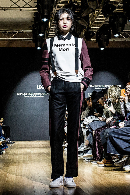
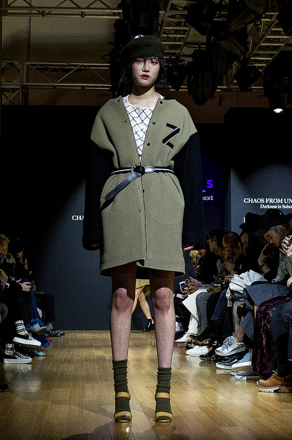
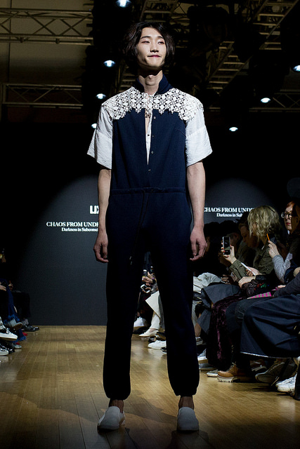
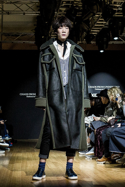
Fashion journalist Anna Kim talks to emerging Korean designer Lyn Jun Park, digging deep into his conscience to get a better idea of who he is and where he is going.

1. Hello, I just want to start off by saying I loved your last collection for Pale Turquoise. Can you tell me how long have you been designing?

I first started to have an interest in dyeing clothes from when I was in school, about 15 years old. I knew how to sew since middle school, but I only created my brand two years ago. Before starting my own brand, I worked in PARTsPARTs as an assistant designer.

2. It is interesting to know that you have been interested in the dyeing process from such a young age; did you go to a special school for this?

Unfortunately, my private school had no fashion or design specialty classes. It did, however, have classes about dyeing. This is not considered a specialty class, since I am from Jeju Island and this is considered common there.

3. Tell me more about your brand.

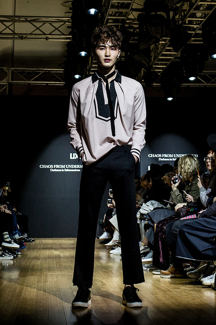
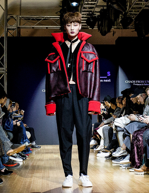
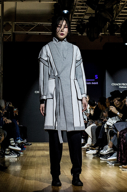
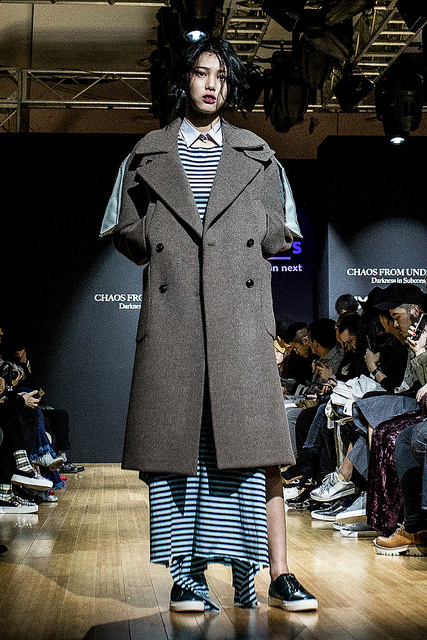
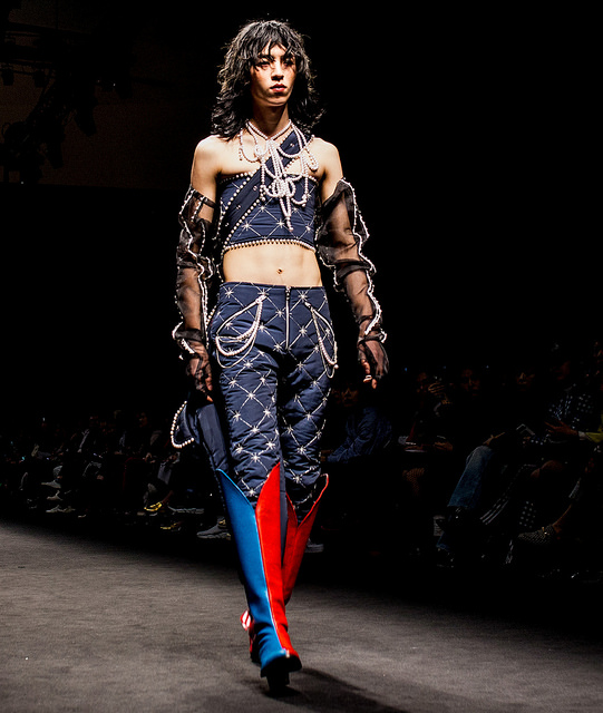
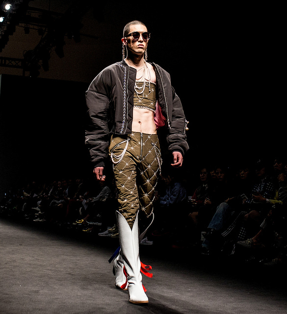
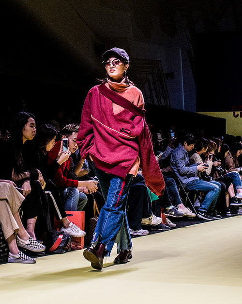
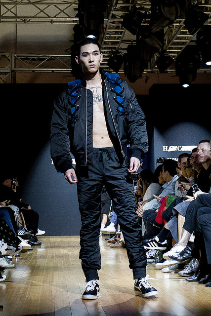
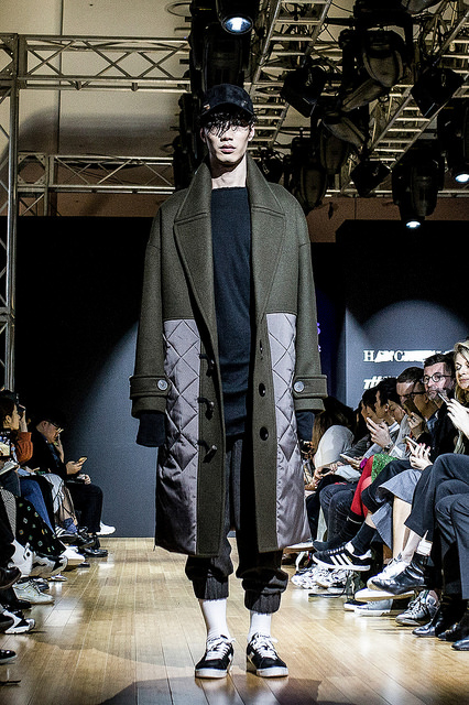
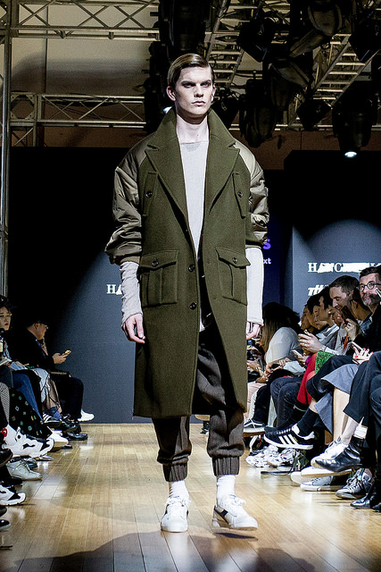
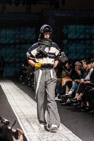
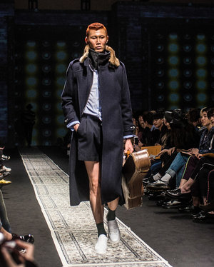
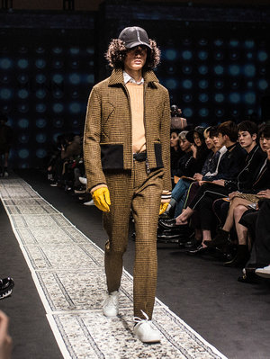
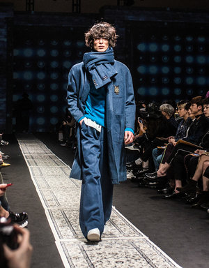
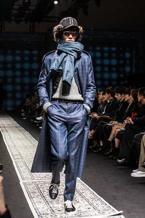
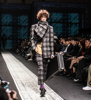
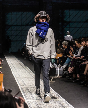
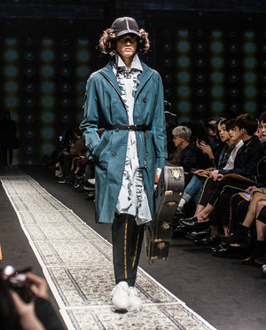
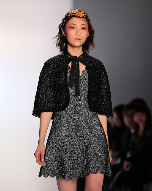
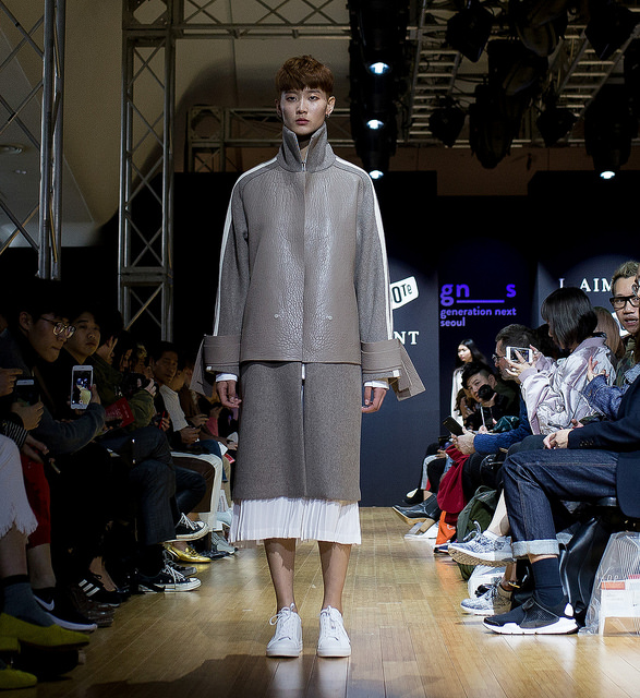
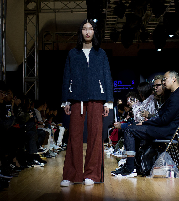
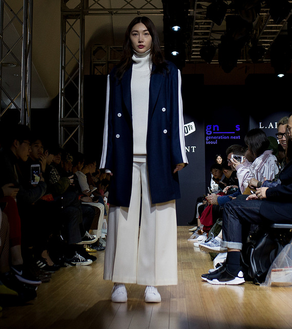
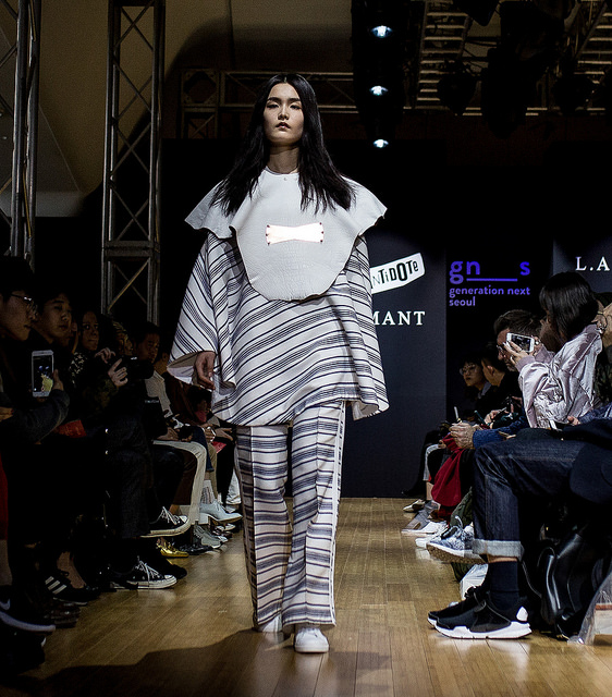
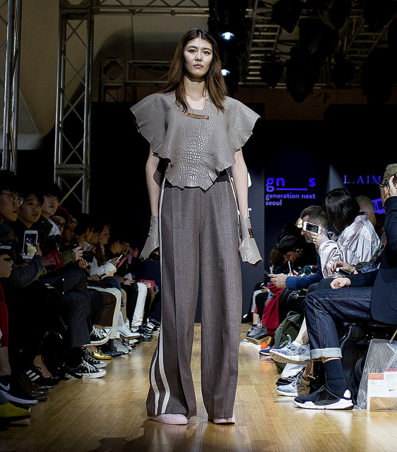
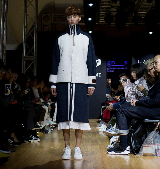
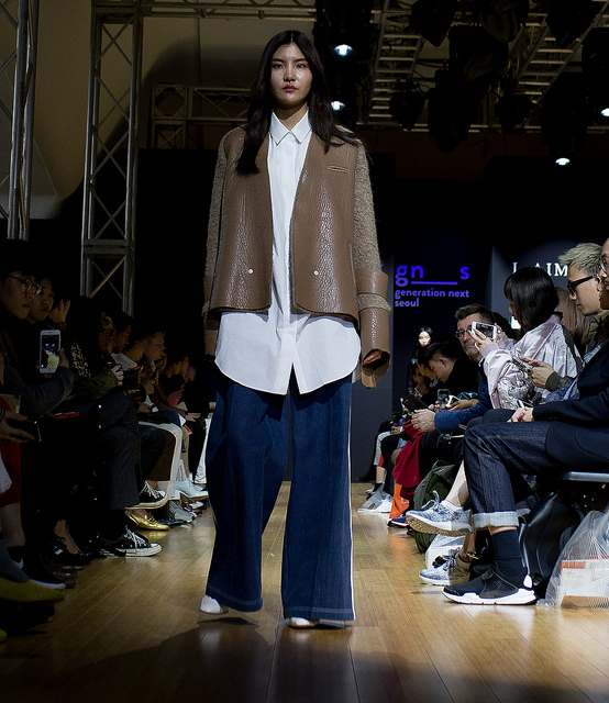
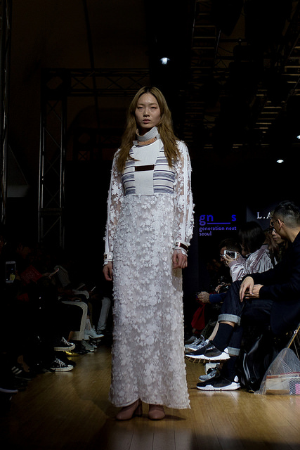
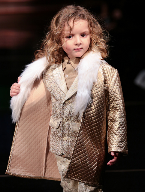
The main concept, or inspiration, for Pale Turquoise is an aquarium full of sea creatures like turtles or jellyfish. Since my brand is so intimately connected to sea life, I have a pass to Lotte Aquarium [in Seoul], because I go there very often—About twice a week.

4. Can you tell me what luxury means to you? Your brand is eco-lux—what does that mean to you?

It is important to be not arrogant, but creative. The main idea of luxury is that it is not affordable. This means my clothes and bags are not for everyone; it is more exclusive. However, despite this, I always keep the environment and nature in mind—This is what luxury means to me.

5. Do you think Korea is ready for luxury brands?

No, unfortunately I don’t think it’s quite ready. Practically, most prefer to buy low-quality clothes, because it’s affordable. But, affordable clothes, or “fast fashion”, are bad for the environment. Like I said earlier, I love the brand PARTsPARTs, where I used to work. Their goal is zero waste, and they create and make clothes in an economical way. They position fabrics as close as possible to minimize waste and cutting fabrics.

6. Do you also follow this principle of zero waste?

Unfortunately, I cannot follow this principle at the moment, but I am really working on decreasing any waste for [future collections].

7. Have you experienced luxury in Seoul?

If you’re asking me about the most luxurious place in Korea, for me a “luxurious” place should reflect a country’s culture and essence. This is why for me the most luxurious place is Gyeongbokgung Palace or Inwang Mountain. I love nature, probably because I’m from Jeju. It is different than what most people think of as luxury. I’m sure most would say gold or something expensive, but for Korea, I think it’s Gyeongbokgung.

8. You said that you have been inspired by the aquarium and PARTsPARTs, but are there any other things that inspire you, like art, movies, or music?

Yes, I am really influenced by music. I listen to different kinds of music, but I prefer fusion hip-hop, which includes Korean traditional instruments. During fashion shows I usually use music with the sound of water and birds. I can even say that it is more like meditation music, good for yoga. Also, I like shapes. Some inspire me, like Korean vases or glasses

9. What will your next collection look like?

I already made a title for the collection; the title will be: The Year 2030. It would have a similar theme to past collections, but a bit more developed and futuristic. When I checked global trends, trend forecasters say that for the next year futuristic themes will be the most popular.

10. Have you collaborated with other designers?

No, I do not want to collaborate with other fashion designers since I’m the best at what I do. But, it would be probably good to collaborate with other designers in other categories, like interior design, for example.

11. Can you give some advice to new designers? What is the best way for new designers to start out?

I would recommend to start from an online store and later have an offline store in shopping centers; however, in reality the best way is to have your own store, which requires a lot of money. In shopping centers you have to pay rent to use the space, so having your own store is really the best way.

패션 기자 김 안나가 최근 인기를 얻고 있는 한국 디자이너 박린준과 함께 그가 어떤 그리고 앞으로 그의 계획이 무엇인지 이야기한다. 

1. 최근 페일 터콰이즈 컬렉션은 정말 아름다웠습니다. 언제부터 디자인을 시작했나요?

15살쯤 이었을때 부터 옷감을 염색하는 것에 관심을 가지기 시작했습니다. 중학생 때부터 바느질하는 법을 알았지만 제 브랜드는 2년전에 만들었습니다. 제 브랜드를 만들기 전에는 PARTsPARTs에서 디자이너로 일 했습니다.

2. 어렸을 때부터 옷감을 염색하는 것에 대해 관심이 있었다니 특이하네요. 특별히 이것을 위해 수업을 들었나요?

안타깝게도 제가 다녔던 사립학교에는 패션이나 디자인 관련 수업이 없었습니다. 하지만 염색에 관련된 수업은 있었죠. 제주도에서는 특별한 수업이 아닌 흔히 볼 수 있는 수업입니다.  

3. 브랜드에 대해 좀 소개 해 주세요.

제 브랜드의 메인 컨샙은 바다 거북과 해파리 같은 해양 생물을 가득한 수족관입니다. 제 브랜드는 해양 생물과 밀접한 관계를 가지고 있기 때문에 저는 롯데 수족관 패스도 가지고 있습니다. 일주일에 두 번 정도 가기떄문이죠.

4. 럭셔리는 어떤 의미입니까? 디자이너님의 브랜드는 eco-lux인데 이것은 디자이너님께 어떤 의미 입니까?

 오만하지 않고 창의적인 것이 가장 중요합니다. 호화로움, 럭셔리함은 가격이 저렴하지 않다는 의미를 담고 있습니다. 이것은 제 옷과 가방은 모두를 위한 것이 아닌, 특별한 것이죠. 하지만 저는 항상 환경과 자연을 생각합니다. 호화로움 이란 저에게 이러한 의미입니다. 

5. 한국 사람들이 럭셔리한 브랜드를 좋아할까요?

 안타깝게도 아직이라고 생각합니다. 대부분의 한국 사람들이 가격이 저렴하고 낮은 퀄리티의 옷을 좋아합니다. 하지만 가격이 저렴한 옷 즉 “빠른 패션 (fast fashion)은 환경에 좋지 않습니다. 제가 이전에도 말했듯 저는 제가 일했었던 PARTsPARTs를 매우 좋아합니다. 그들의 목표는 낭비를 하지 않는 것이죠. 그들은 옷감을 자르거나 옷을 만들 때 최대한 낭비를 하지 않으려고 노력합니다.

6. 디자이너님도 무폐기물 규칙을 따르나요? 

안타깝게도 지금은 따르지 못하고 있습니다. 하지만 저는 앞으로의 제 컬렉션에서는 최대한 낭비가 없도록 하기 위해 노력하고 있습니다. 

7. 서울에서 호화로운 경험을 한 적이 있었습니까?

 한국에서 가장 호화로운 장소라고 한다면 저는 ‘호화로운, 럭셔리한’ 장소는 그 나라의 문화를 잘 반영한 곳이어야 한다고 합니다. 이러한 의미에서 저에게 호화로운 장소는 경복궁, 혹은 인왕산 입니다. 아마 제가 제주도에서 와서 그런지 몰라도 저는 자연을 사랑합니다. 대부분의 사람들이 생각하는 호화로움과는 조금 다를 것 이라고 생각합니다. 대부분의 사람들이 호화로움을 생각하면 금 혹은다른 비싼 것들을 생각할 것입니다. 하지만 한국의 호화로움은 저는 경복궁이라고 생각합니다. 

8. PARTsPARTs, 그리고 수족관에서 영감을 받는다고 이야기 하셨는데, 음악이나 영화처럼 다른 것에도 영감을 받나요?

 네, 음악에서 영감을 많이 받습니다. 여러 가지 음악을 듣지만 저는 한국 전통 악기의 연주가 포함된 퓨전 힙합을 가장 좋아합니다. 패션쇼에서 저는 물과 새 소리를 많이 씁니다. 명상, 그리고 요가를 할 때 듣는 음악과 비슷하겠네요.  또한 저는 형태를 좋아합니다. 한국의 자기나 그릇들이 저에게 영감을 주기도 합니다. 

9. 다음 컬렉션은 어떠한가요? 

제 다음 컬렉션의 주제에 대해 생각을 해 보았습니다. 바로  ‘2013년’입니다. 최근 컬렉의 주제와 좀 비슷하지만 조금 더 발전되고미래 지향적인 룩 입니다.. 글로벌 트렌드를 보았을 때 이런 미래 지향적인 주제는 인기가 많을 것이라 생각됩니다. 

10. 다른 디자이너와 함께 일한 적이 있습니까?

 아니요, 저는 제가 잘 한다고 생각하기 때문에 다른 디자이너와 별로 일을 같이 하고 싶지 않습니다. 하지만 다른 분야의 디자이너들과는 함께 일해보고 싶습니다. 예를들어 인테리어 디자이너 같은 경우 말이죠. 

11. 새로운 디자이너에게 조언을 해줄 수 있을까요? 신입 디자이너들은 어떻게 시작하는 것이 좋을까요? 

온라인 샵을 먼저 만들고 나중에 쇼핑센터에 오프라인 샵을 만드는 것을 추천하지만 가장 좋은 방법은 자신의 샵을 가지는 것입니다. 물론 돈이 많이 들기는 합니다. 쇼핑센터에서는 임대료를 내야 하기 때문에 자신만의 샵을 가지는 것이 가장 훌륭한 방법입니다. 

Original Interview: Anna Kim
Translation: Diana Horsfall